
Superhumon-Inspired
生產力與 SaaS
淺色介面編輯雜誌風漸層設計系統
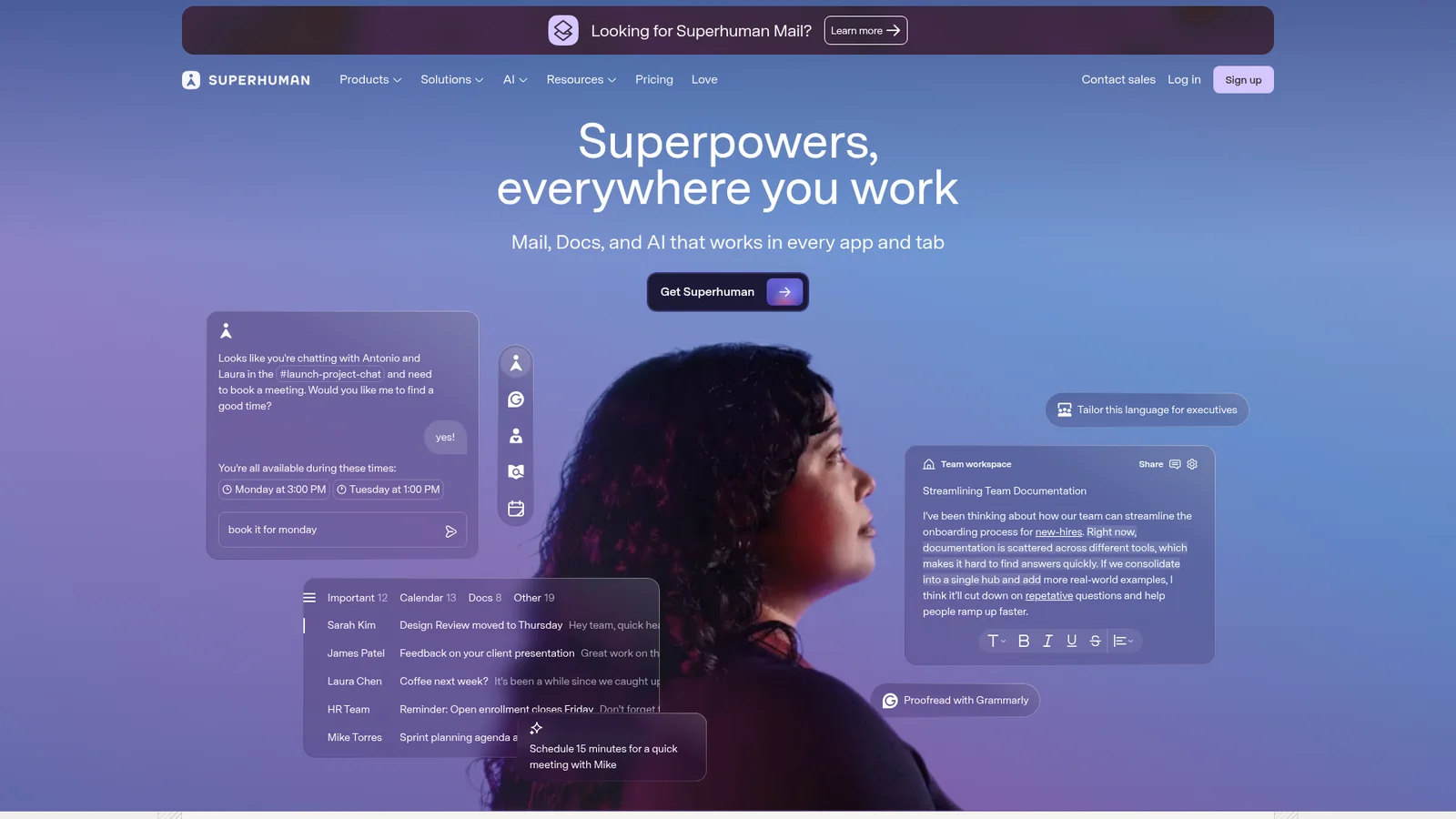
An inspired interpretation of Superhumon's design language — a fast-email productivity brand split between an editorial dark hero (deep indigo navy with violet-sky atmospheric backdrop and a portrait subject) and a quiet white content body with off-warm-grey ink. The system uses a single proprietary variable display sans, heavy weight 460–540 with tight tracking, and a deep-teal closing CTA band that breaks the indigo/white rhythm with a warm dark interlude. Buttons are tight rounded rectangles, pricing is sober and dense, and the brand reads more like a high-end newsletter than a SaaS app.
正在載入設計文件…
正在載入代幣…