PlayStation
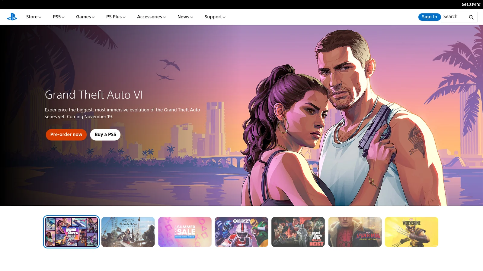
A three-surface marketing system organized around alternating black, white, and PlayStation Blue chapters that scroll past the viewer like a console launch trailer. Each section has a single editorial purpose — hero photography, console product render, PS Plus tier callout, news strip — and each owns one of three full-bleed canvas modes. The chrome is unusually quiet for a gaming brand: bright PlayStation Blue (`#0070d1`) carries every primary CTA as a fully-rounded pill, the proprietary SST face renders display copy at a signature weight 300 (light) for an airy, premium feel, and a crisp 8px-radius secondary card system carries product info on either canvas mode. The system never decorates — no gradient backgrounds on chrome, no atmospheric mesh, no drop shadows beyond a faint section-divide. Imagery does all the heavy lifting: console glamour shots, game key art, and PS Plus tier illustrations occupy 60-90% of every section, with copy compressed into a small editorial slot.