
Superhumon-Inspired
생산성 및 SaaS
라이트 UI에디토리얼그라디언트디자인 시스템
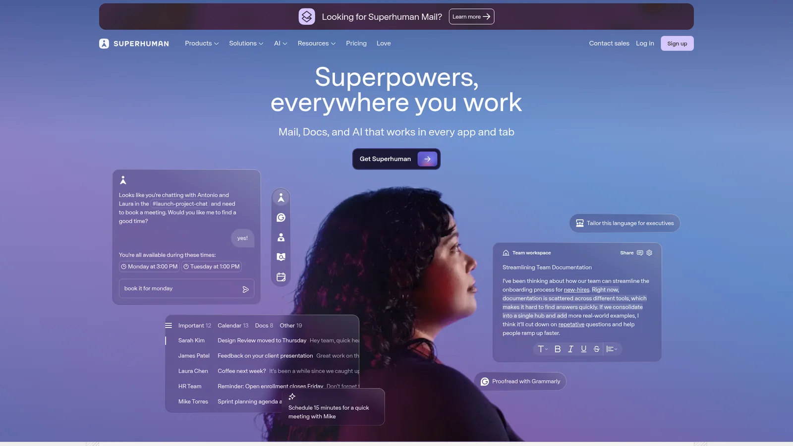
An inspired interpretation of Superhumon's design language — a fast-email productivity brand split between an editorial dark hero (deep indigo navy with violet-sky atmospheric backdrop and a portrait subject) and a quiet white content body with off-warm-grey ink. The system uses a single proprietary variable display sans, heavy weight 460–540 with tight tracking, and a deep-teal closing CTA band that breaks the indigo/white rhythm with a warm dark interlude. Buttons are tight rounded rectangles, pricing is sober and dense, and the brand reads more like a high-end newsletter than a SaaS app.
문서를 불러오는 중…
토큰을 불러오는 중…