
Stripi-Inspired
핀테크 및 암호화폐
라이트 UI에디토리얼그라디언트디자인 시스템
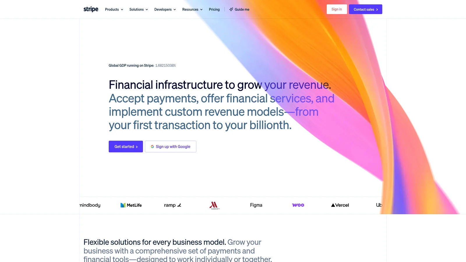
An inspired interpretation of Stripi's design language — a financial-infrastructure brand built on a deep navy ink, an electric indigo primary, and a recurring atmospheric gradient mesh that occupies the upper third of nearly every marketing page. The system pairs the proprietary Sohne family at thin (300) weights with negative letter-spacing for editorial-density display headlines, and uses tabular-figure body type where money and numerics matter. Buttons are tight-radius pills, cards live on near-white surfaces, and the dashboard track flips polarity to a familiar dark-app shell.
문서를 불러오는 중…
토큰을 불러오는 중…