Mastercard
핀테크 및 암호화폐
라이트 UI에디토리얼럭셔리디자인 시스템
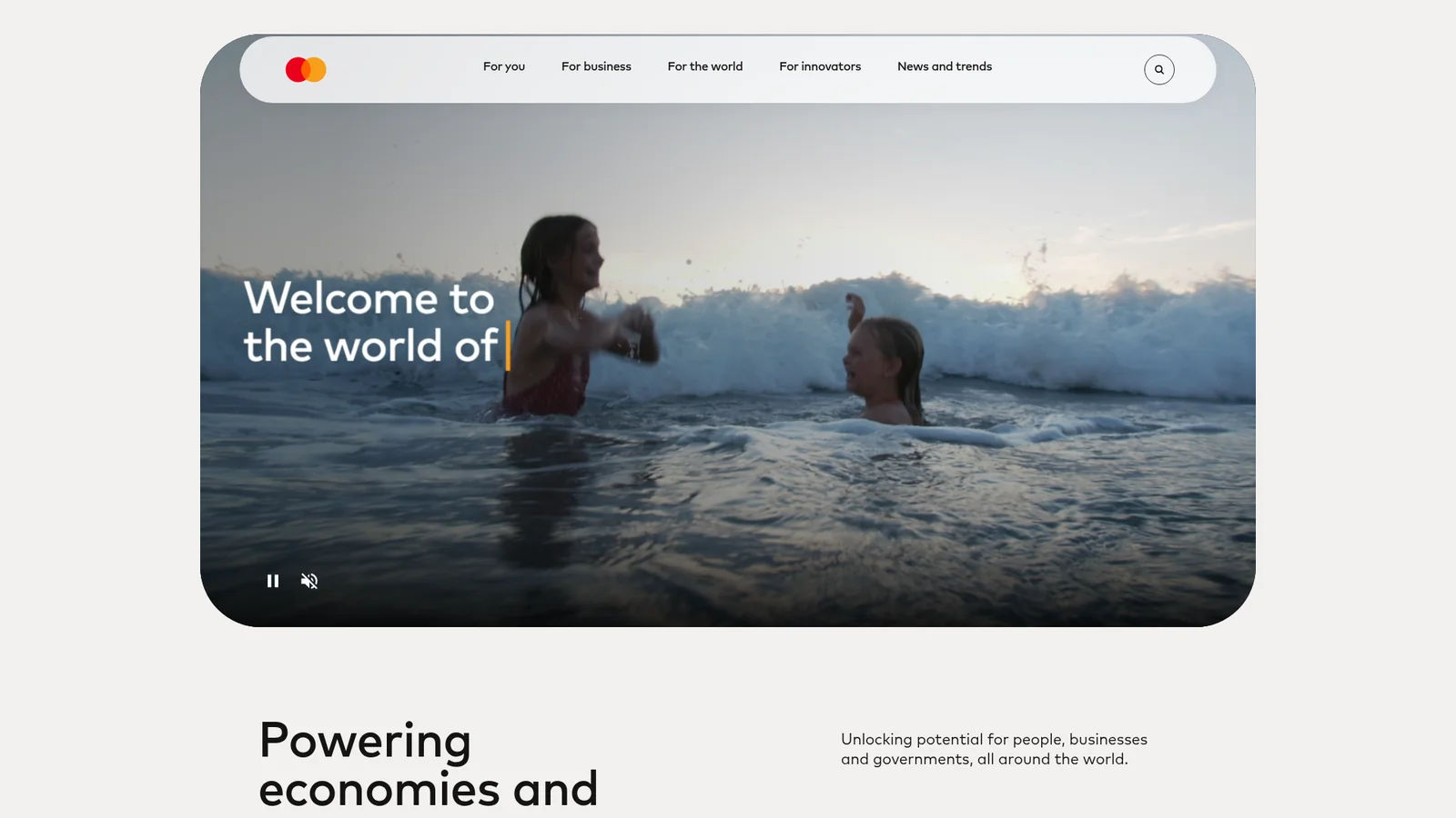
Mastercard's experience reads like a warm, editorial magazine built from soft stone and signal orange. The canvas is a muted putty-cream (`#F3F0EE`) — not white, not gray, but a color that feels like the paper of a premium annual report. On top of that canvas, everything that matters is shaped like a stadium, a pill, or a perfect circle. The dominant visual gesture is the **oversized radius**: heroes carry 40-point corners, cards go fully pill-shaped, service images are cropped into circular orbits, and buttons either complete the pill or fit snugly at 20 points. There are almost no sharp corners anywhere on the page.
문서를 불러오는 중…
토큰을 불러오는 중…